Ready to dive into the world of abstract art but not sure where to begin? You’re in luck! Today, I’ll walk you through my entire abstract painting process, starting from the basics (hint: it involves a lot of doodling and scribbling) all the way to creating a unique masterpiece without needing to worry about complex composition or color schemes.
And more good news: no need to break the bank with a ton of paint colors, mediums, or tools. I’m all about keeping it simple and budget-friendly. I’ve been there, done that with expensive art supplies that don’t deliver what they promise. Trust me, you’ve got everything you need right at home.
If you’re looking for an actually relaxing, and easy painting idea then you should definitely give abstract painting a try.
Together, we’ll explore 13 techniques using household items like bubble wrap, Q-tips, salt, and parchment paper to create stunning textures and patterns with acrylic paint. And as for paint colors? Just grab your basic white, black, blue, and yellow – that’s all you’ll need.
Before we begin, check out this list of 50+ abstract painting ideas for more inspo.

How do you start an abstract painting?
So, you know that one question everyone’s got about abstract art? Yeah, it’s that fear of staring at a blank canvas and not knowing where to start. But guess what? It’s totally normal! Abstracts are more about freeing your mind than nailing perfect brushstrokes.
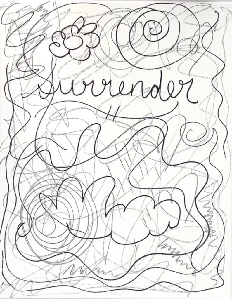
So, here’s what I do: grab a Sharpie and jot down a word. Could be anything – a feeling, a challenge, even just a random thought. Then, let loose! Scribble, doodle, whatever feels right. It’s all about getting those creative juices flowing without overthinking it.
By the end of this step, your canvas won’t be so intimidating. It’ll have just enough character to dive into those layers without stressing. And trust me, it’s a scribbly-blast!
Abstract Art Techniques
Once you’ve let loose with your scribbles and squiggles, it’s time to dive into the paint layers. This is where the fun continues! I’ll walk you through a relaxed and liberating approach to applying paint to your canvas. Abstract painting is all about breaking free from strategic thinking and embracing spontaneity. The more you let go of perfectionism and overthinking, the more vibrant and alive your artwork becomes.
Forget about painting for a specific outcome – focus instead on the sheer joy of applying paint and creating patterns that resonate with you. Abstract art is a journey of trial and error, and each layer is an opportunity to explore, learn, and discover what brings you happiness. There’s no pressure to get everything perfect in one go; instead, we’ll embrace each layer as a chance to see where it takes us and how we can incorporate elements that spark joy into the next stage of our painting.
Technique 1: Bubble Wrap Stamps
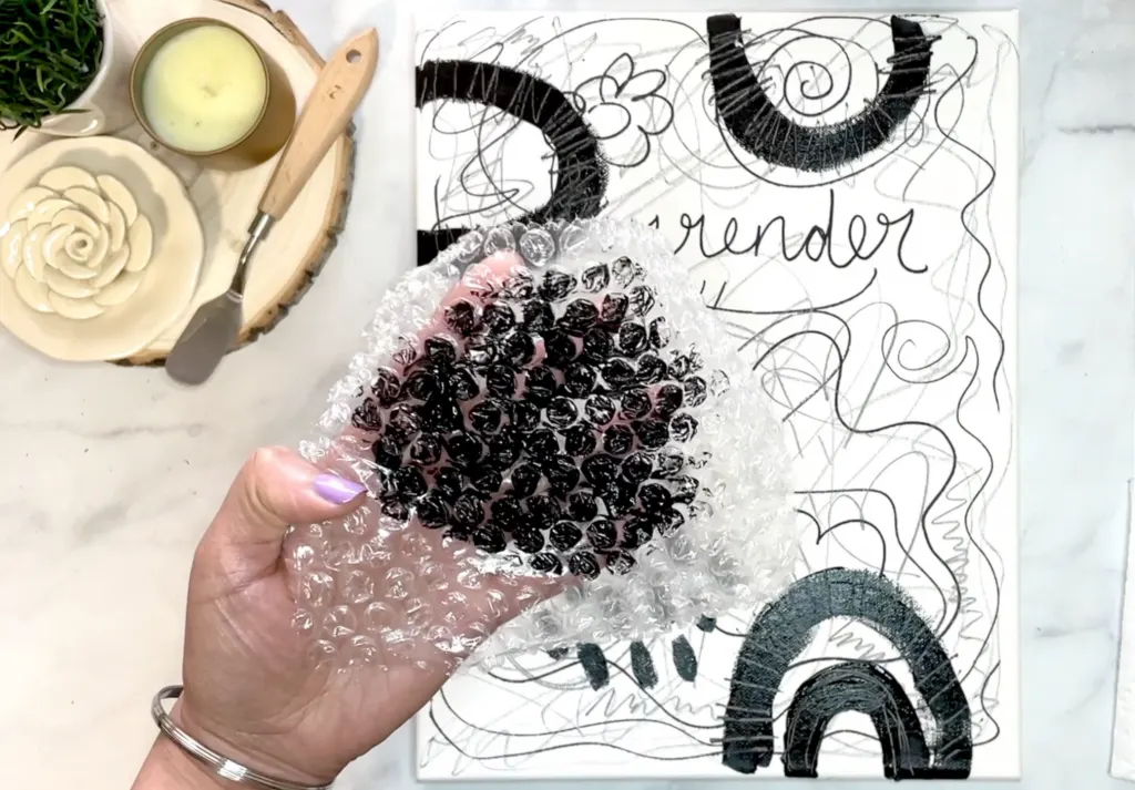
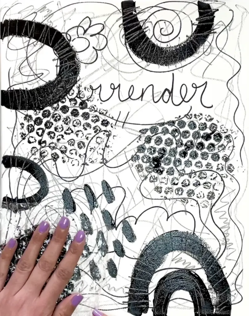
The easiest way to get a nifty honey-comb like pattern is simply taking some bubble wrap (the stuff your amazon packages are wrapped in sometimes) and using it as a stamp! Simply brush on a layer of paint right onto your bubble wrap, then flip upside down on your canvas and voila, a sweet as honey-comb pattern right on your canvas. You can use this stamping method on any layer if it resonates with you.
Tip: Repeat Your Favorite Pattern Around The Canvas
As you introduce any individual mark or pattern on your canvas (using any of the techniques in this tutorial), you repeat it in other parts in your artwork. I prefer to incorporate them in sets of three or five. The reason behind distributing them across the canvas lies in captivating the viewer’s attention and guiding their gaze throughout the piece.
By repeating these charming patterns in different areas, you’ll encourage a dynamic viewing experience, preventing the eye from drifting away. For example, if you place a mark at the bottom, consider replicating it on the sides and top as well.
Technique 2: Etching With Skewers
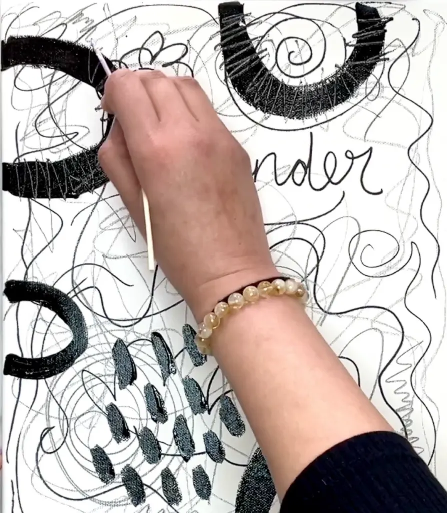
Etching adds texture effortlessly to your painting. Using a sharp tool like a wooden skewer, scratch into wet paint, revealing layers underneath. As it dries, it creates bumpy textures, adding character. This technique lets lower layers peek through, enhancing depth. Remember, it only works with wet paint. Experiment with straight lines, flowing scribbles, signatures, or doodles for unique effects.
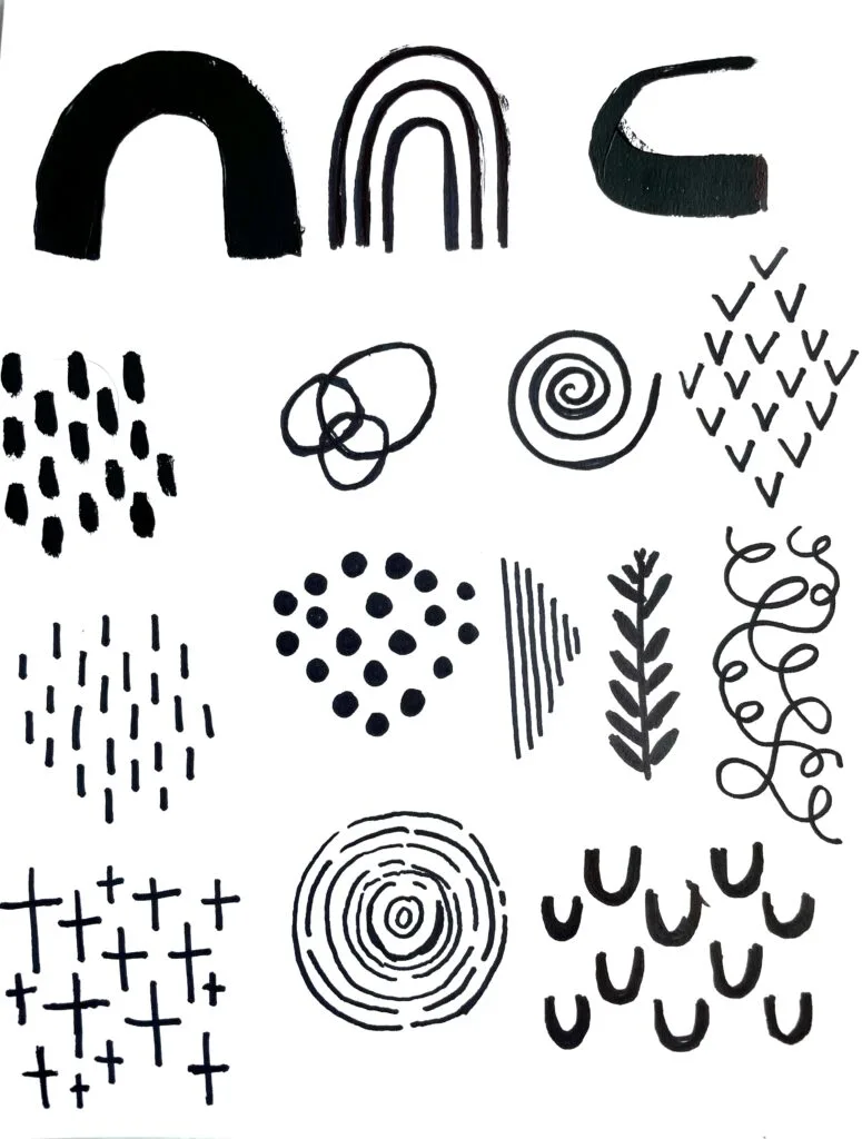
Technique 3: Make Big And Small Marks Using Cheatsheet
If you’re unsure what to paint, try a marks cheat sheet! You can create your own or use the one I made below. When making your own, include a mix of big, medium, and small marks to give you options for your canvas. You can also try brushstrokes techniques like these, and see what speaks to you.
Technique 4: Non-Dominant Hand Marks
Here’s a cool trick for looser strokes: switch hands! Use your non-dominant hand to paint the same marks you’ve been playing with. You’ll see how different they turn out. For an extra challenge, paint a whole layer using your non-dominant hand.
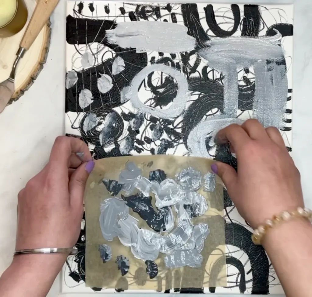
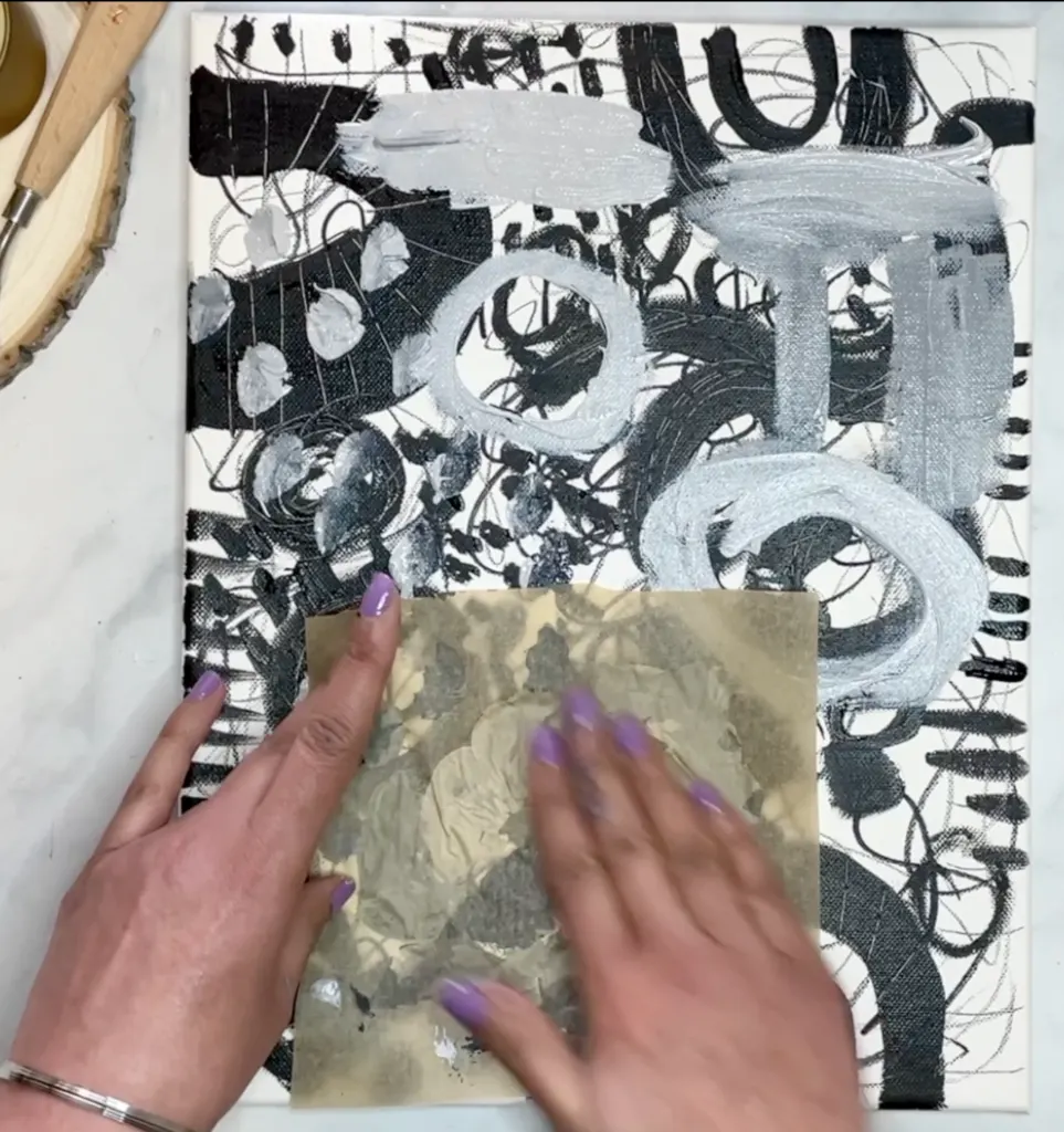
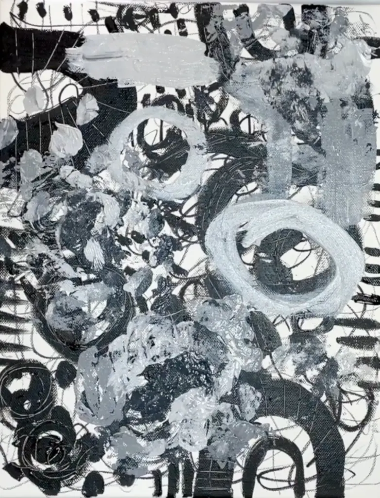
Technique 5: Parchment Paper Transfer
This method is very easy and it’s also fun (and accessible!). All you need is parchment paper ( the same stuff you use or baking) cut into a small square or rectangle. Then just blob on different color or tones of paint in a random pattern. Flip it over and use your hand to press and smooth it out. Once you peel the parchment paper off you’ll get a nifty “smeary” design. I find this is a nice way to just get paint across your canvas, especially when you’re stuck.
Technique 6: Salt Texture
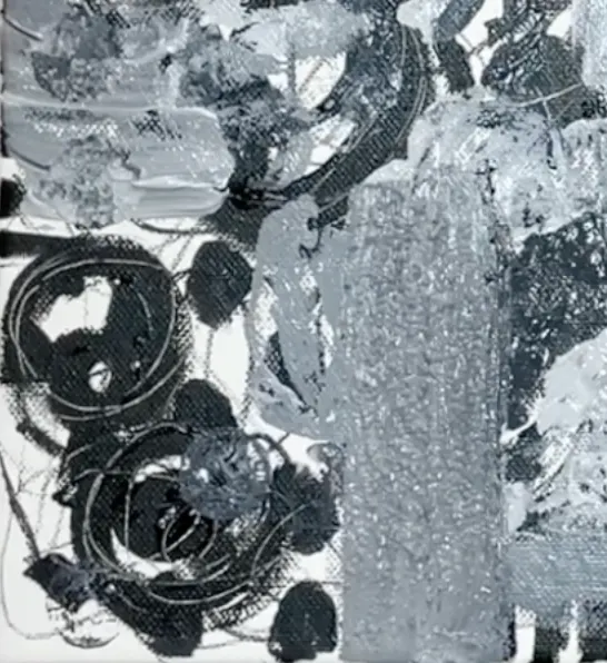
Texture can bring your abstract painting to life and it’s simpler than you think. Instead of pricey texture mediums, try household salt. Mix it with acrylic paint to create a paste, then apply it to your canvas. Use it sparingly to avoid excessive bumpiness. For example, try a stroke at the bottom and a couple around the canvas to guide the viewer’s eye.
Technique 7: Wine Cork Stamps
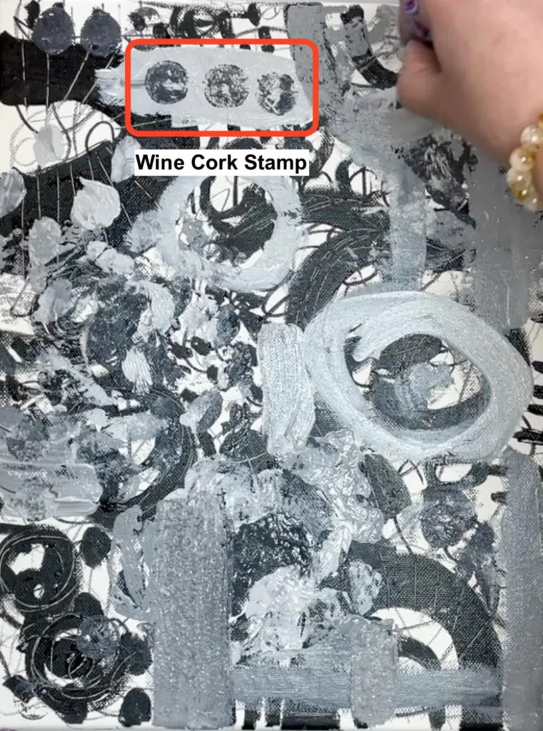
Get creative with everyday items like wine corks to craft eye-catching circular stamps for your art! Grab some from your recycling bin, dab paint on one side, and press onto your canvas. No corks? No problem! Explore your recycling stash for bottle caps, lids, cardboard, foam, net bags, mesh, and more!
Technique 8: Grid Pattern with Skewers
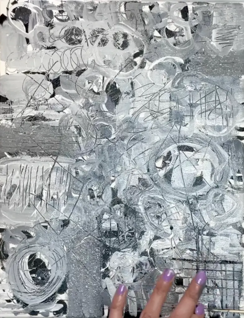
Grid patterns add a delicate, geometric vibe to your finished piece. Using a wooden skewer to add thin lines in a grid pattern also adds more finer, delicate marks which contrast he bolder ones. Just brush on paint on any side of your skewer, press down on canvas, and “swipe” off, to get thin straight lines.
Technique 9 : Parchment Paper Stencils
If you’re into repeating patterns in your art and seek an effortless way to replicate them, stencils are your go-to. Forget about purchasing them – craft your own using parchment paper! Not only are they as effective as store-bought ones, but you can tailor them to add your own flair. I particularly adore this technique as it lets me blend intricate details with striking, large-scale patterns. Simply fold your parchment paper into thirds, ensuring the folded edges overlap, like you would do when making paper dolls. Cut out a basic shape, unfold, and you’re all set!
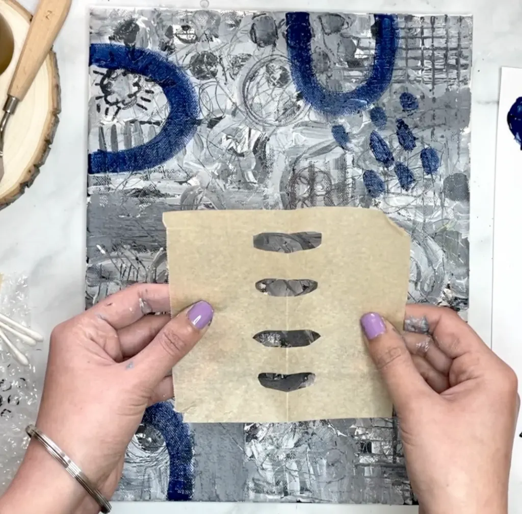
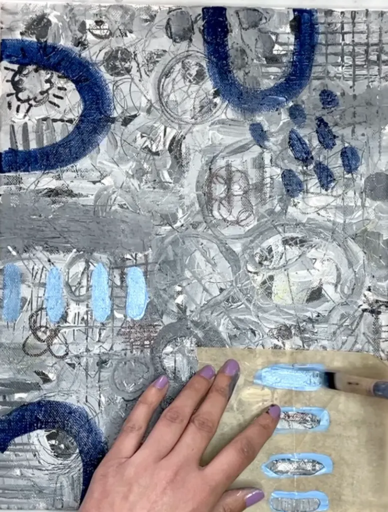
Technique 10: Cool QTip Dots
Grab a Q-tip, dip it in paint, and start creating intricate polka dot patterns! Q-tips are awesome for painting because they give that cool stippled effect. You can use them to make polka dots or even try out some pointillism. And don’t be afraid to scatter small dots all around for some extra flair!
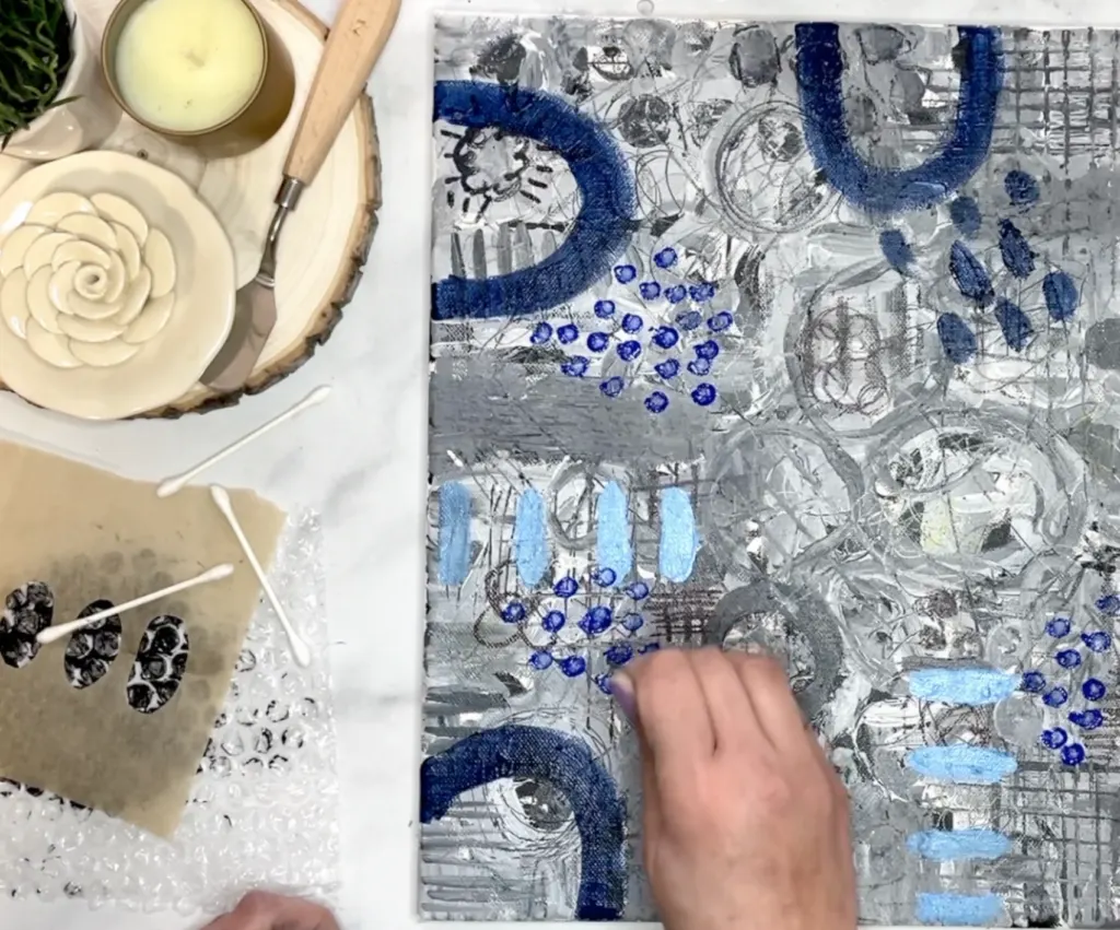
Technique 11: Intricate Tick Marks
Ever admired those fine tick marks in abstract art and wondered how they’re done? Chances are, the artist used a fine point paint marker for those precise lines. Personally, I swear by the FlyMaxx White paint pens for this. The key to achieving tick marks is to space them evenly, forming a brick-like pattern (start with rows, then shift the next row to begin between two ticks above), ensuring they seamlessly merge into one cohesive design.
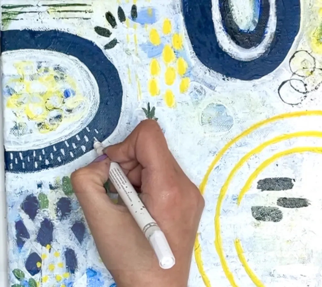
Technique 12: Choosing Your Color Palette
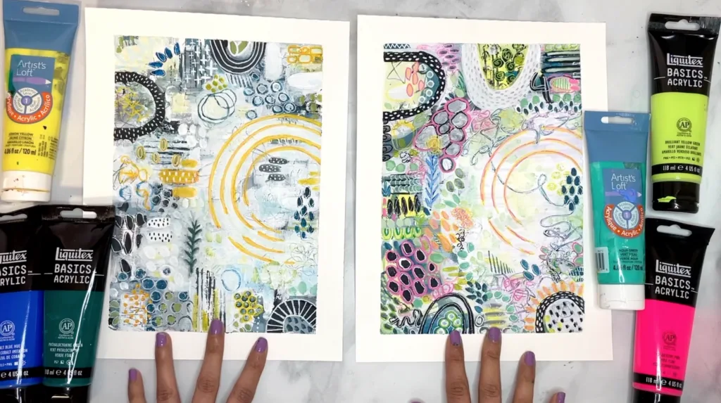
Since color is a very important part of painting let’s take a moment to discuss how to select your color palette. In this tutorial, I’ve opted for a blue, yellow, and green scheme, but you’re welcome to experiment! For instance, I’ve also tried this painting with lime green, aqua, and fluorescent pink for a livelier look. To simplify, consider choosing three colors: one as your primary hue, another for main accent color (used modestly), and the third is a secondary accent color to add visual interest which is used very sparingly.
For color ideas, just look around your home and see what colors you’ve already got in your decor. It’ll feel more personal since those are probably the colors you’re already drawn to.
How To Paint Abstract Step-By-Step
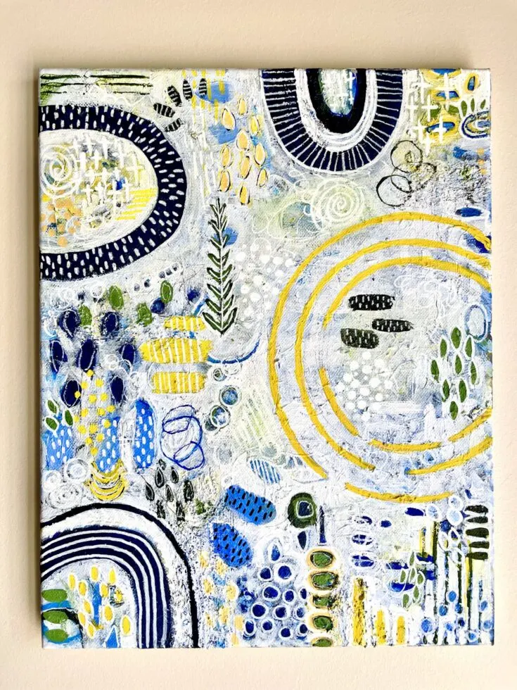
Learn how to paint an abstract artwork in this easy step by step tutorial for beginners. You'll have fun using household items and learn 13 different abstract techniques along the way.
Materials
- 11x14 stretched canvas
- Ultramarine Blue
- Cadmium Yellow Medium Hue
- Titanium White
- Mars Black
- White Paint Marker (fine tip)
- 1/4" flat brush
- size 3 round brush
- small detailing brush
Tools
- Household items used:
- -bubble wrap
- -wine cork
- -wooden skewer
- -salt
- -parchment paper
- -QTips
Instructions
- Follow along with the youtube video
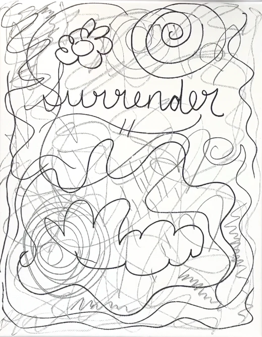
- In the first step, select a meaningful word and write it on the canvas with a Sharpie Marker to set the painting's intention. I've chosen "surrender" to remind myself of finding peace amidst challenges beyond my control. Next, let your creativity flow as you doodle and scribble across the canvas, breaking through any fear associated with a blank surface. Consider using a pencil for a different tactile experience, adding further depth to your marks.
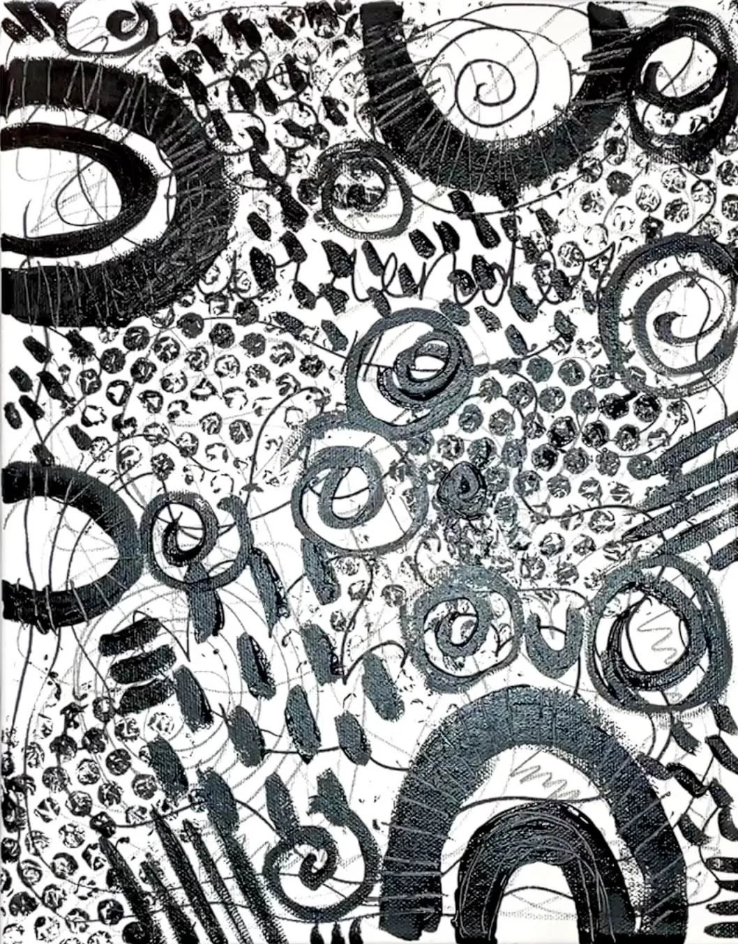
- Now we’re diving into bold marks with black paint to add depth and set the stage for layering. For this layer I used the marks cheat cheat that inspired the big bold arches and tick marks with my brush. I then used the etching method with a wooden skewer to get an etched look in my black paint. I also used bubble wrap to make the beautiful honeycomb like patterns you see. This step is about experimenting with different marks and techniques, there's no need to stress about perfection - we'll layer up later. And let the black paint dry before moving onto the next step.
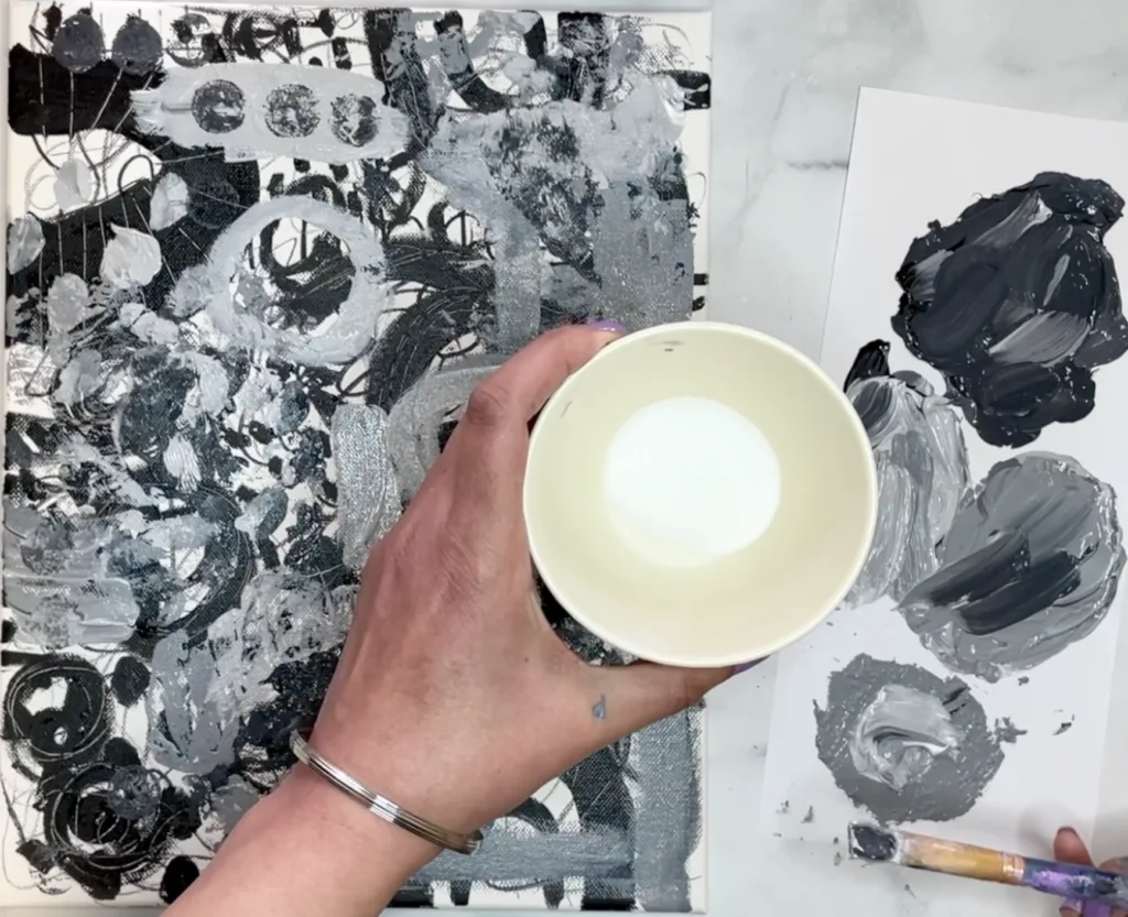
- Let's explore the world of greys before we dive into the rainbow! To start, mix up three shades of grey using various amounts of white and black paint. Try to aim for a dark charcoal grey, a medium grey and a light grey. Now, onto some exciting techniques! Use your non-dominant hand to make marks to start out with, it adds a whole new level of looseness to your artwork. A few more fun techniques to play with In this layer are: parchment paper transfer, wine cork stamps, salt texture, skewer grid lines. This layer is also meant to be intuitional, so just be free here. Let your layer dry before moving on.
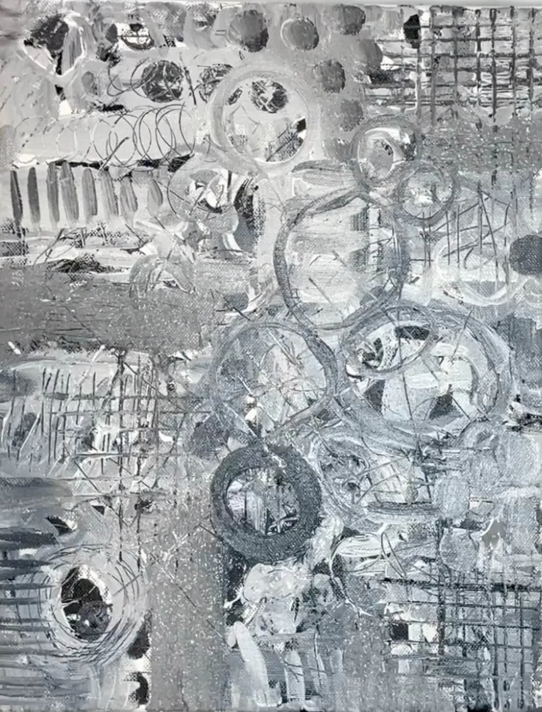
- While we wait for our painting to dry, let's talk about choosing your color palette. In this tutorial, I've gone with a combination of blue, yellow, and green, but feel free to get creative! For example, I've also experimented with lime green, aqua, and fluorescent pink for a more vibrant vibe. To keep it simple, try selecting three colors: one as your primary hue, another as a main accent color (used sparingly), and the third as a secondary accent color for added visual interest, used very sparingly. For color inspiration, take a look around your home and see what colors are already part of your decor. Using these familiar colors can make your painting feel more personal since they're likely hues you're naturally drawn to.

- Moving on to the next layer, we're focusing on our primary color choice, with blue taking the spotlight. Using ultramarine blue mixed with white and black, I've created three distinct shades for depth and contrast. Drawing inspiration from patterns in the previous black layer, I’ve chosen to repeat the big arches with navy paint and experimenting with q-tips for finer details. Parchment paper stencils are another handy tool, allowing for bold, repeating patterns. Stepping back periodically ensures a balanced mix of marks and colors, essential for creating visual interest. Once satisfied, let the painting dry before proceeding to the next step.
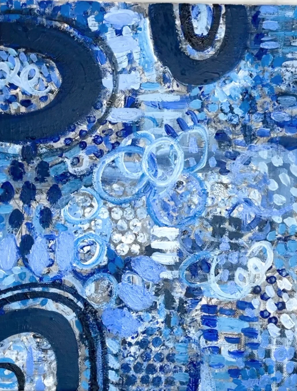
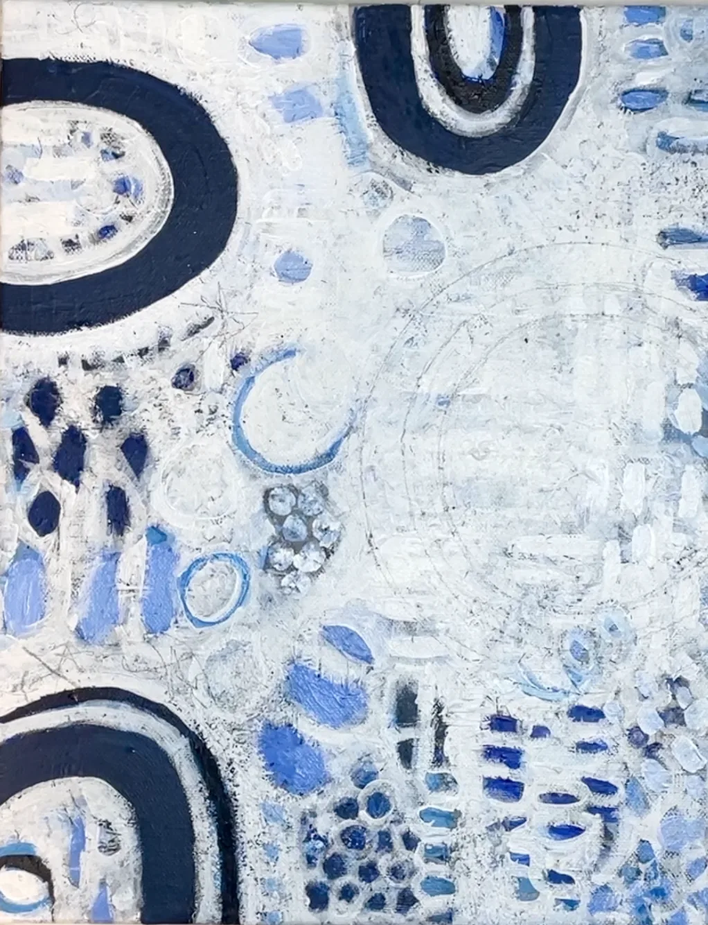
- In this step, we're adding white space over the blue background, like a sculptor carving out the essence of their masterpiece. Starting with a focal point (in this case, I want to paint 3 large yellow rings on the right side, so I’ll make sure there’s a nice clutter free background for it), we give it room to shine without overcrowding. Use your bigger brush loaded with white paint for the big areas, and switch over to the smaller brush t get around the smaller marks/patterns. Also, applying thin layers of white paint lets the layers beneath peek through, and softening the edges gives a gentle vibe. As we work, we carve out white space around elements that resonate with us, making them stand out even more. Take breaks to help avoid overworking to keep things balanced. Once you’re happy, let this layer dry before moving forward.
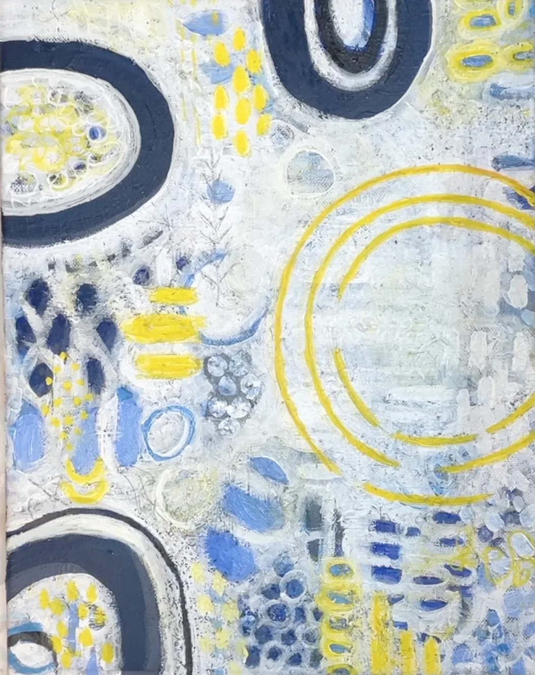
- Let's work on creating the focal point of our abstract painting by using a main accent color. I’ve chosen yellow as my accent, but you can choose whichever color you’d like. I’ll be using the yellow to paint three large yellow rings on the right side as my focal point in this painting. Using household circular objects, I'll trace these rings before adding layers of yellow paint. I’ll add a smidgen of titanium white to my yellow for opacity (since yellow is super translucent out of the tube). I'll also scatter subtle touches of yellow across the canvas to complement the focal point without stealing it’s spotlight.
- In this step, we're bringing in a new color to liven things up. While I chose green, you can choose any color that speaks to you. To create the green, I mixed ultramarine blue and cadmium yellow, adjusting with white and black to great 3 different greens (1 light, 1 medium and 1 dark) to work with. Adding a secondary accent color adds depth, like a subtle spice in a recipe. The green marks should be delicate, blending in but adding flavor. Think small leafy shapes, tiny ticks, thin rings, and lines for balance.Sprinkle them lightly around the canvas to keep the eyes engaged and moving.
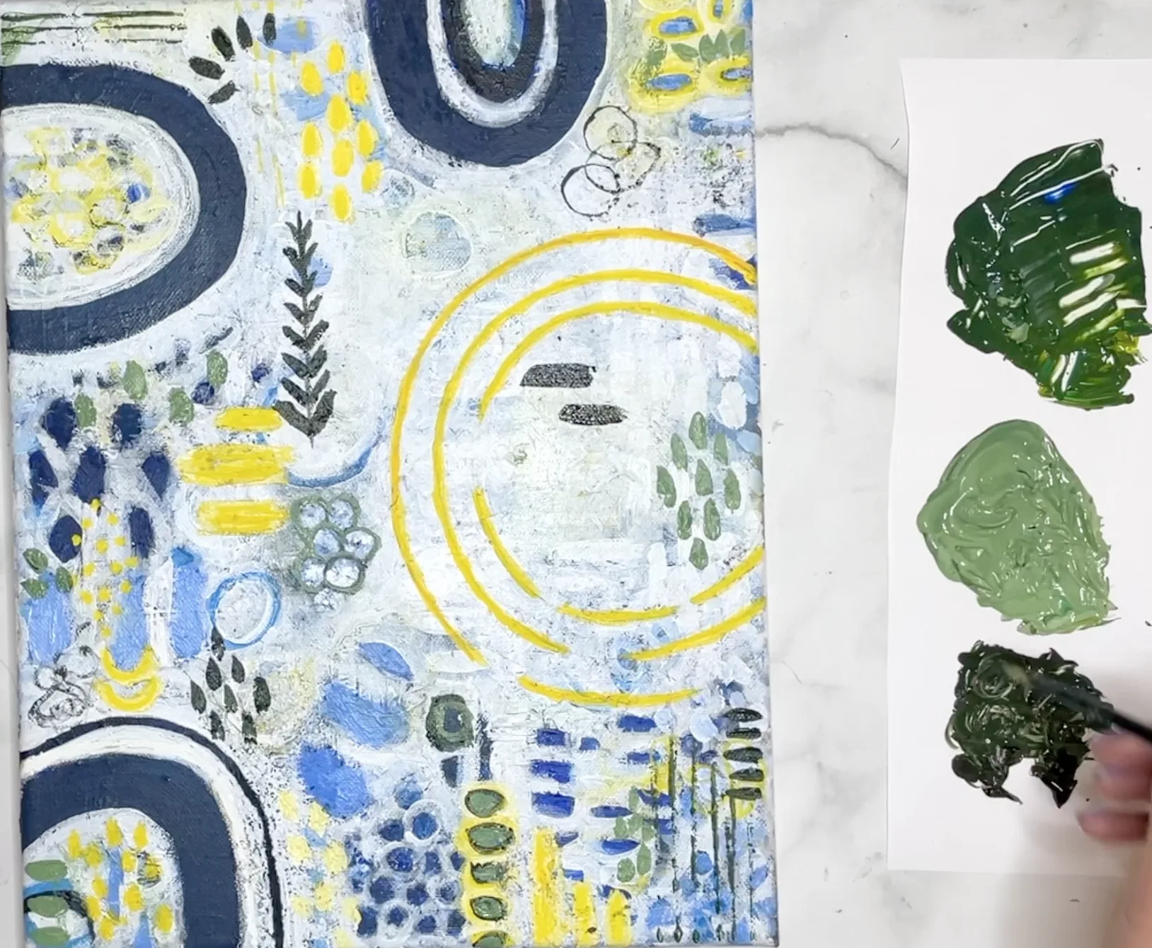
- Alright, we're at the final stretch! Grab your white paint marker or a small detail brush dipped in thinned down white paint for more precision. In this step, focus on tiny details like tick marks inside big shapes, thin borders around bigger shapes, and thin curved or straight lines. If you're feeling adventurous, you can also use a black marker, but use it sparingly since it's very bold and can throw off the balance of the painting. Remember to step back and take a fresh look before wrapping up; it's like adding the cherry on top of your cupcake after all the hard work!
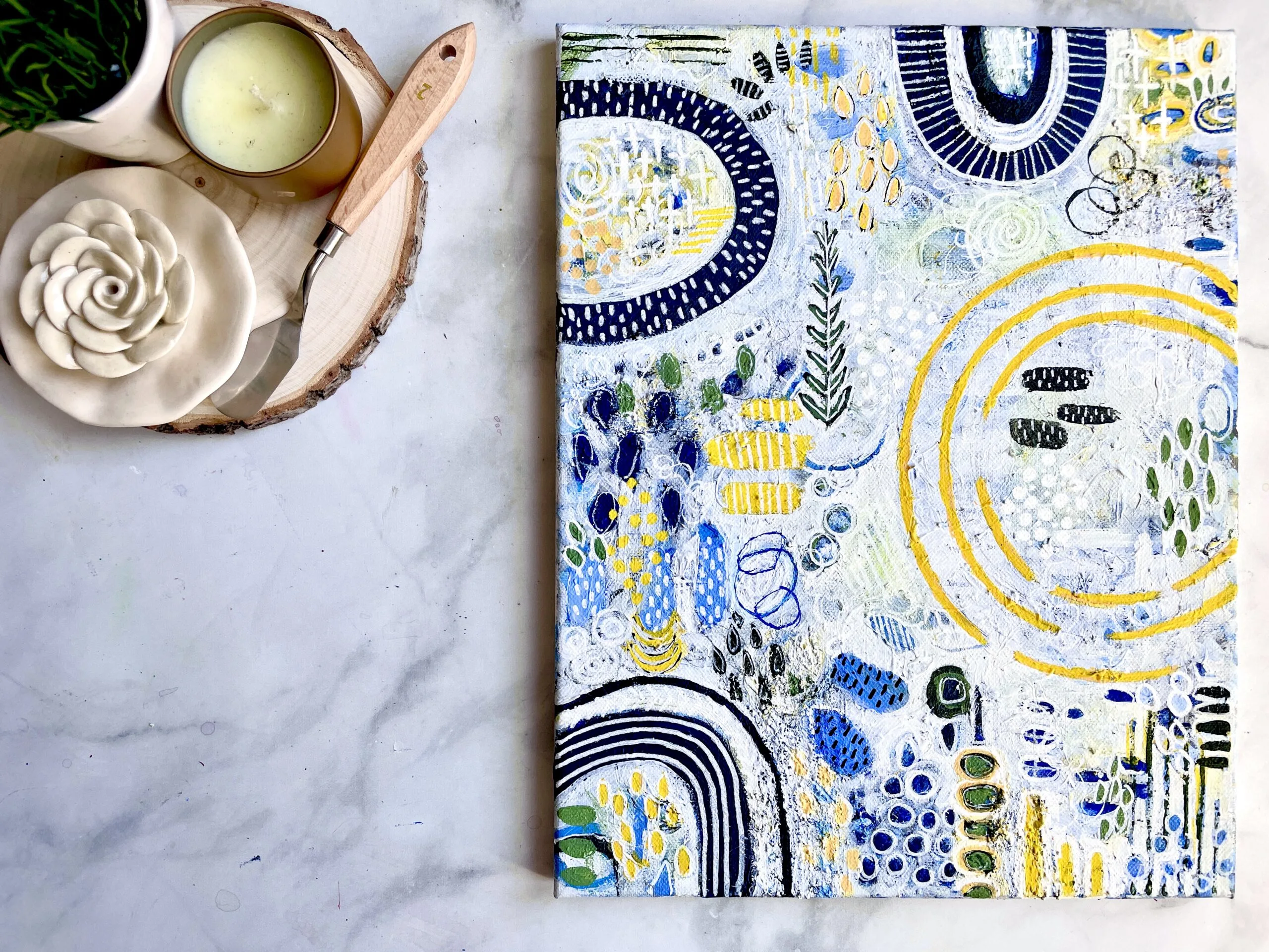
Final Painting Pictures
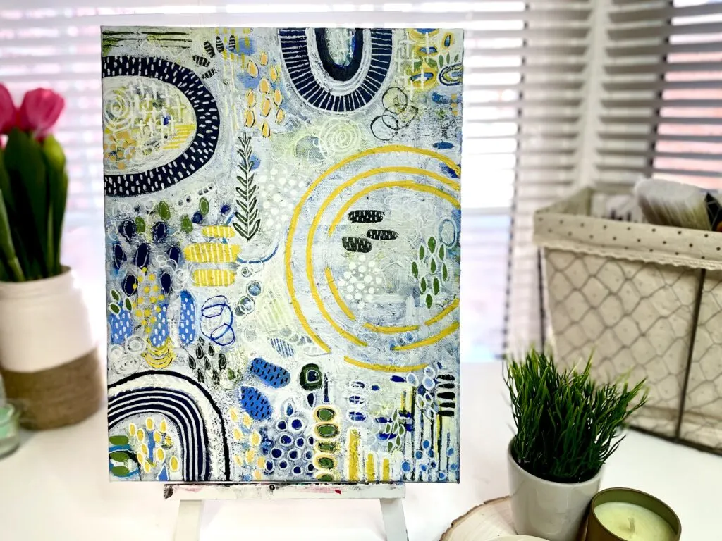

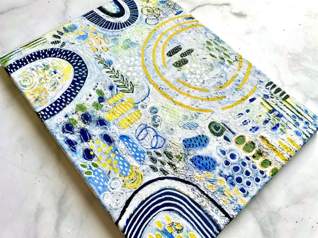
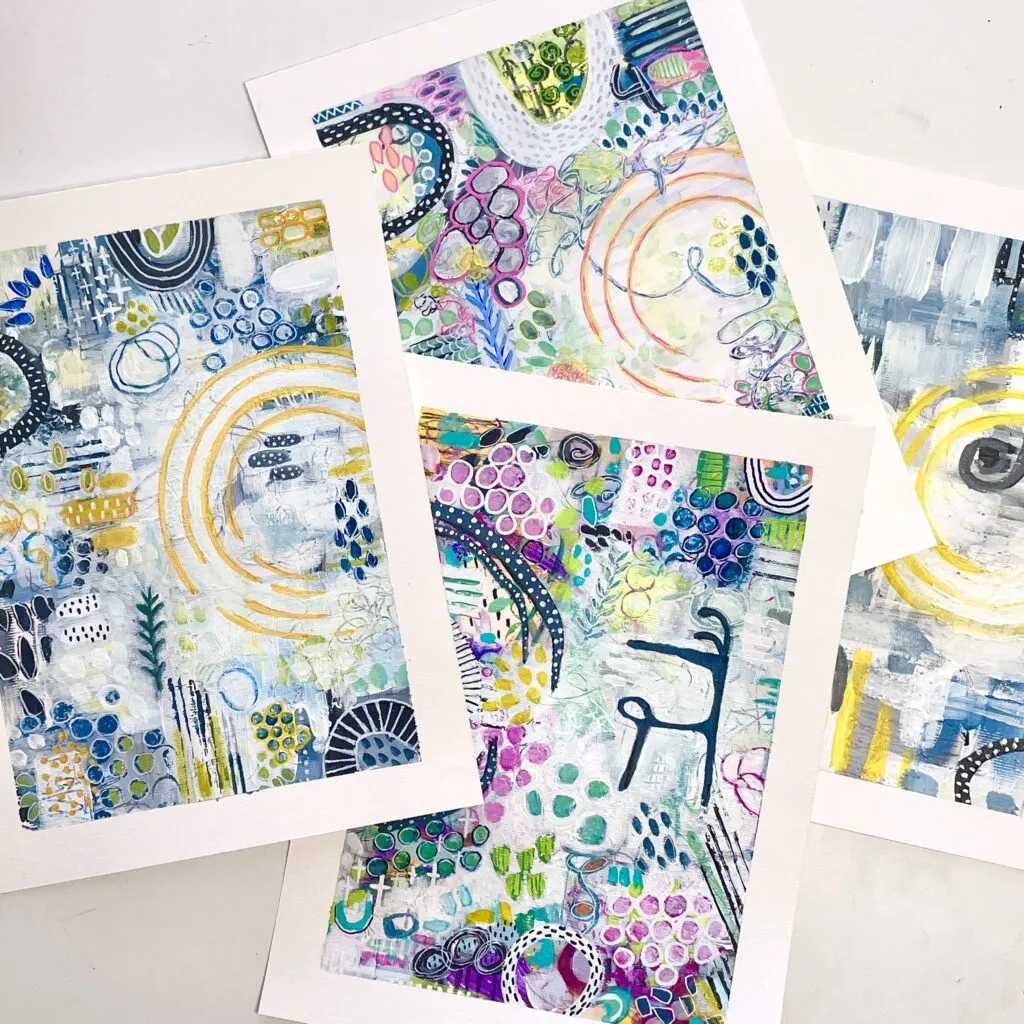
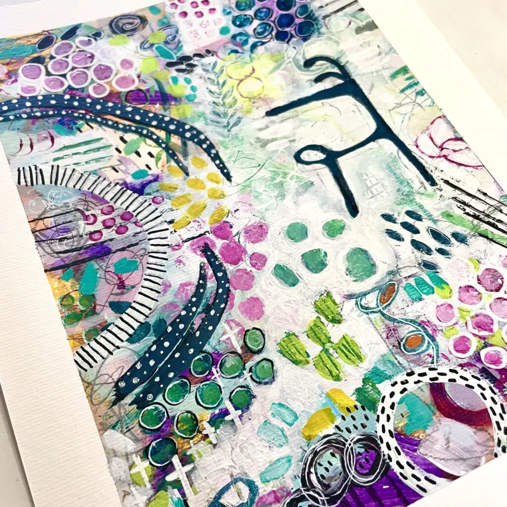
Life Is Like a Abstract Painting
You never know how it’s going to turn out.
To me, abstract art is like life unfolding in layers. Even if you don’t see every layer in the final artwork, each stroke sets off a chain reaction, shaping the next layers and eventually forming the whole piece. It’s kind of like life itself, where early experiences influence every choice, guiding us on our journey. That’s why every abstract painting, even from the same artist, is one-of-a-kind. Each layer adds its own twist, sending the painting in its own direction. So enjoy the ride – just flow with the abstract painting wave.
Pin If you Liked This Abstract Painting Tutorial

